Combining the dynamism of red and the happiness of yellow, the colour orange is a feast for all the senses. While it manifests itself as dazzling sunsets and zesty fruits in the natural world, orange is used in various art forms as a symbol of power and positivity.
From skyscapes to cocktails, vintage cars to architecture—join us as we take a closer look at orange wall art, revealing the uplifting effect it can have on our emotions and our homes.
Bold, bright and full of energy
From burnt orange to fire—these shades embody the heat so inherent to the second colour of the rainbow. Be it in the form of a stunning summer sky or a sizzling autumn bonfire, orange is Mother Nature’s way of radiating her natural beauty, warmth and light.
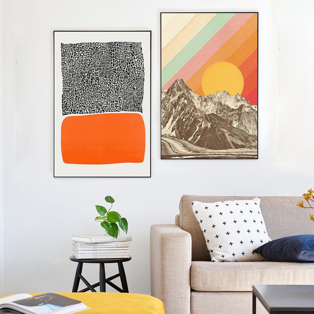
Two of our favourite sunny prints are ‘Mountainscape’ by Florent Bodart and ‘City Sunset’ by Fox & Velvet. With his technicolour design, Florent Bodart shows us that other colours can sit alongside bold oranges without being overpowered. Combine warm orange canvas art with prints in luscious pinks, for example, and you’ll have a dynamic match made in heaven.
Meanwhile, Fox & Velvet go for a more abstract take on the star that gives us life. Placing their sunshine below the black tower blocks, they invert the power balance between a force of nature and the city. The resulting implication is that, as the sun goes down, it momentarily becomes the energy core of the metropolis, directing admiring onlookers’ attention away from the streets and up to the skies.
So much flavour to savour
In addition to daylight and skylines, the colour orange also brings to mind the citrus fruit after which it is named. Fragrant, juicy and oh-so-delicious, oranges have become a staple part of our diet ever since they were introduced into Europe around the 15th century.
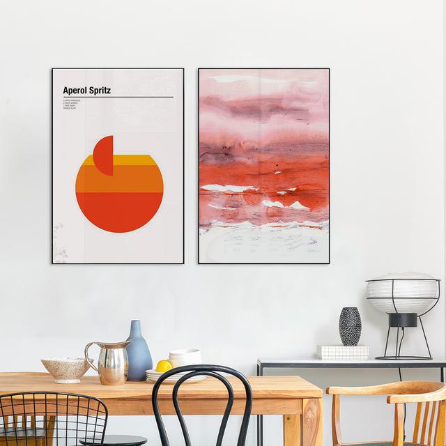
Whether you enjoy them as a mid-morning snack or as cocktails at night, with Nick Barclay's tantalising prints you can pay homage to your favourite orange delights. Take ‘Aperol Spritz’, for example, in which the artist superimposes a bright cocktail motif on a background of plain white. In doing so, Nick Barclay emphasises the punchiness of orange both as a colour and as a flavour—the perfect arty addition to any kitchen or dining room.
On the other hand, Iris Lehnhardt’s take on the ‘flavour’ of orange is relatively figurative, almost poetic. Blending the colour seamlessly together with its neighbour, pink, the German illustrator follows a colour-pairing principle similar to that of Florent Bodart. The effect of ‘Pink and Modern Orange’? A smooth concoction of fruity flavours that look good enough to eat.
Stepping back in time
Orange wall décor can also have a similar effect to that of sepia. Dreamy and summery, with a hint of nostalgia, it makes the onlooker feel as though they were wearing a pair of orange-tinted spectacles. Think sweet summers spent rolling through the meadows, road trips across sunkissed desert plains…
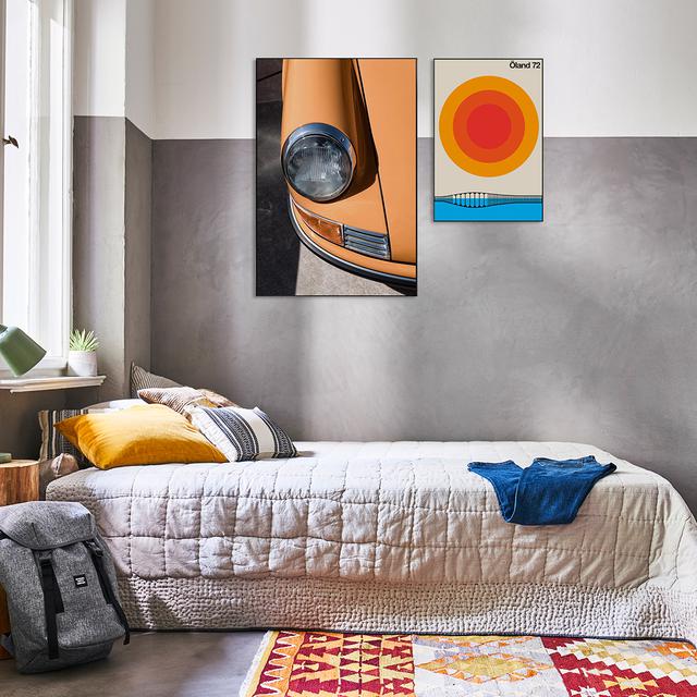
What’s more, combining pale oranges with retro paraphernalia gives the recipe for vintage nostalgia—as can be seen in Jens Ochlich’s ‘Porsche 911’ print. The photographer’s clever use of shade contrasts with the honey-orange paintwork, thus highlighting the pure beauty and vintage charm of this classic American motor.
Also touching on the theme of travel, Bo Lundberg takes us on a trip back to the 1970s with his idyllic Swedish island print, ‘Öland 72’. In our eyes, by juxtaposing clear aquamarine blue with bright shades of orange, the artist paints a very vivid picture of decades gone by—thus hinting that we can keep our sunniest memories alive by hanging up technicolour travel art in our home.
A journey to another dimension
More powerful than yellow, yet less imposing than red, the colour orange is used to make a statement in all seven of the established art forms—be it literature, music or film. Popular works include the novel A Clockwork Orange and the iconic film Trainspotting, whose use of orange aesthetics is powerful, striking and unforgettable.
Another realm in which orange makes a statement is that of architecture. Two of our favourite examples are ‘Marienplatz’ by Flo Klein and ‘ICC no.11’ by Michael Belhadi. The former photograph, taken in the Marienplatz station in Munich, has a futuristic feel to it thanks to the bright orange tiling and the photographer’s choice of angle; one which emphasises the spaceship-like arching of the tunnel’s ceiling.
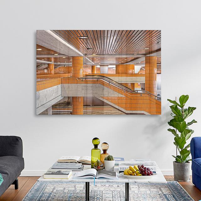
This otherworldly effect can also be ascribed to Michael Belhadi’s photograph of Berlin’s International Congress Centre. What makes it so impressive is, as we see it, the photographer’s choice of perspective—a floor-to-ceiling vista of the entire structure, from its brown-orange beams down to the lone strip of orange paint. In this way, Michael Belhadi showcases the architectural style and technicolour aesthetic that characterised 1970s design. Fun fact: the ICC has even featured in sci-fi films such as the Hunger Games franchise and Atomic Blonde.
The colour orange imbues an interior with warmth, flavour and fun. Sounds appealing? Take a look at our collection and find the orange wall art that lights your fire.
Text: Lucy Woods